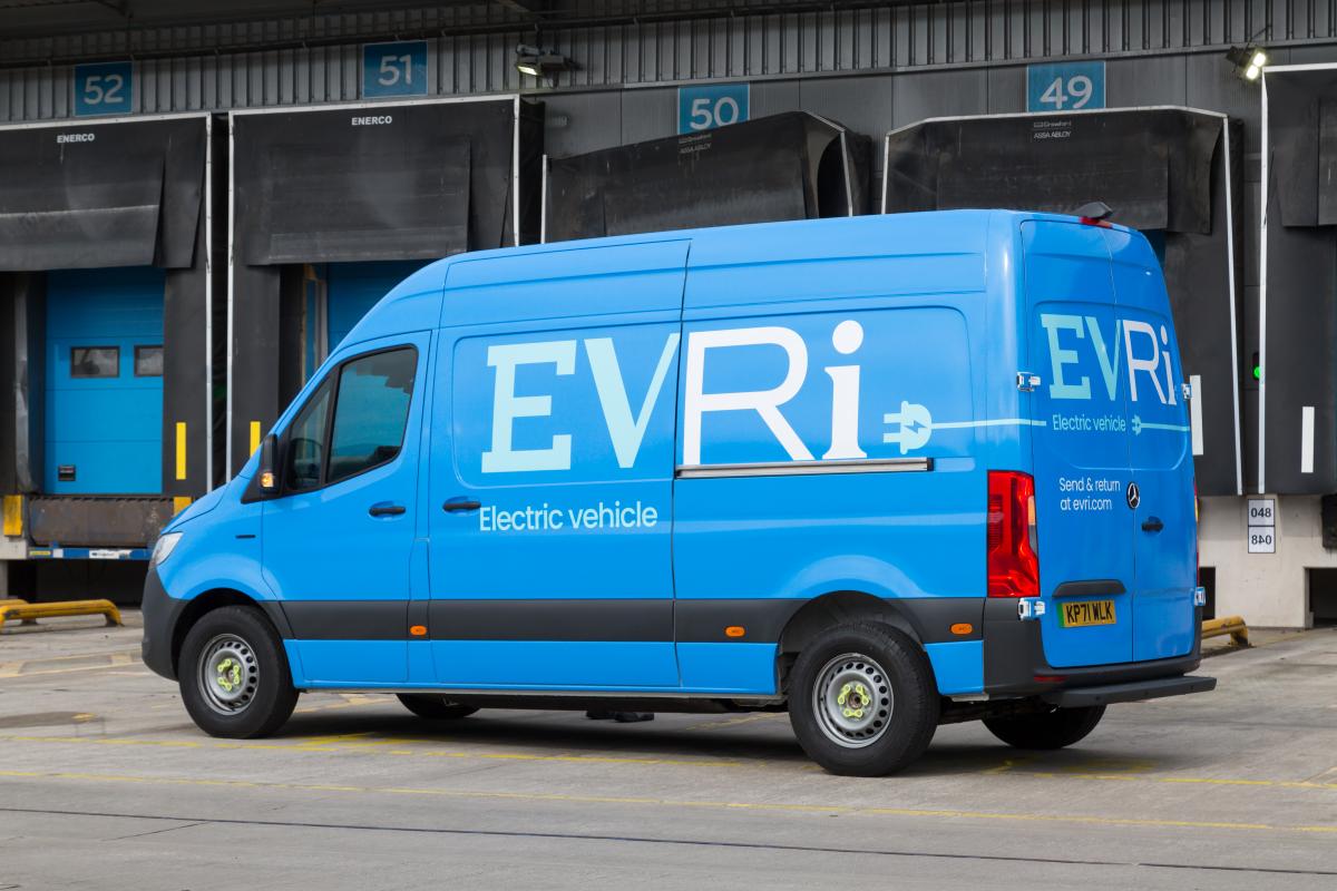
Who says a new design can’t change a brand’s fortunes? For Hermes, 2022 was a pivotal year. One of the UK’s most prominent courier services by volume, its reputation was marred by a history of poor customer service. Persistent allegations of employees mishandling parcels led Citizens Advice to rank the company last in its delivery firm league table.
However, a change of ownership provided a catalyst for change, and the business seized the opportunity for an organisational reset that reaffirmed its position as a disruptor in the sector. Enter Evri. And two years on, it’s safe to say that the new brand has reached a moment of transformation.
As reported in their recent business announcement Evri’s revenue in 2024 hit £1.7bn, marking a 15.2% increase from the previous year. This was made possible by setting a new delivery milestone, with 730m parcels distributed across the UK in the 12 months to March - an almost 15% year-on-year rise.
Looking beyond the numbers, Evri is testimony to the fact that rebrands don’t need to be complicated. Yes, it has evolved its brand and shifted its proposition. But more than anything, it has embraced simplicity - the North Star for navigating complex change.
Audience complexity
Communications-led rebrands have historically focussed on winning over the end user. While building affinity with this group was certainly important for Evri, the reality is that these aren’t the only people paying the bills.
The new brand needed to serve the complexities of the business. This included its stakeholders: investors, the board; delivery partners; business customers and employees; as well as the people across the length and breadth of the UK to whom the company delivers parcels to every day.
Business and brand strategy
For Evri, the main challenge was devising a way to maintain its broad appeal throughout the rebrand, without sacrificing the individuality that resonated across its entire business.
The organisation’s growth was dependent on expanding its appeal to new customers - be it individuals trying to supplement their income or multi-million pound businesses. However, it couldn’t lose what made it different. Namely, that it delivers to every street, everyday across the length and breadth of the UK.
With so many different sizable audiences to consider, the brand needed to be instantly gettable. Simplicity was the best way to articulate this; too much strategy (and too much complexity) rarely lands well.
Creating an identity
Evri understood that simplicity is the most effective way to drive impact, which was reflected in the way it brought its strategy and design together. This started with the company’s new name, with its phonetic spelling emphasising its universal appeal - it delivers to “Evri one”, “Evri where”. As Evri’s Chief Customer Officer, Chris Ashworth noted, "it is a true representation of every person we employ and serve, and every community and business we support.”
This consistently also extended to its visual identity. The omnipresent blue colour palette breeds familiarity and boosts brand recognition, while the 194,000 possible logo variations (courtesy of ‘variable font intelligence’ - an AI powered tool to generate different stylings) enabled Evri to keep its sense of individuality alive.
While Evri’s financial results are rightfully celebrated, it's the ability to embrace a new identity which stands out, without losing sight of the core values that it stands for, that should really grab the headlines.
For Chris Ashworth, the new brand “has unified and energized our business and supported our extraordinary growth - providing a North Star for our customer-centric innovation and directly contributing to our recent change in ownership.”
Evri has now amassed more than three million 5-star ratings on Trustpilot; with an aggregate score of 4.2, it ranks among the UK’s six leading providers. Furthermore, as widely reported by the media, the business value more than doubled from the brand launch in March 2022 to the sale to Apollo Global in July 2024. This success is testament to the transformative power of a rebrand - particularly one which emphasises simplicity, and doesn’t get in its own way.
Authored by Matt Boffey, Chief Strategy Officer, Design Bridge and Partners London - partners of The Marketing Society
Published on 27 November 2024


