‘Objects which have been of use to me nearly all of my life.’
Henri Matisse, Note on the back of a photograph of his possessions, 1946
I recently attended an exhibition presenting works by Henri Matisse alongside the treasured personal possessions that inspired them. (Matisse in the Studio, The Royal Academy, London, until 12 November.)
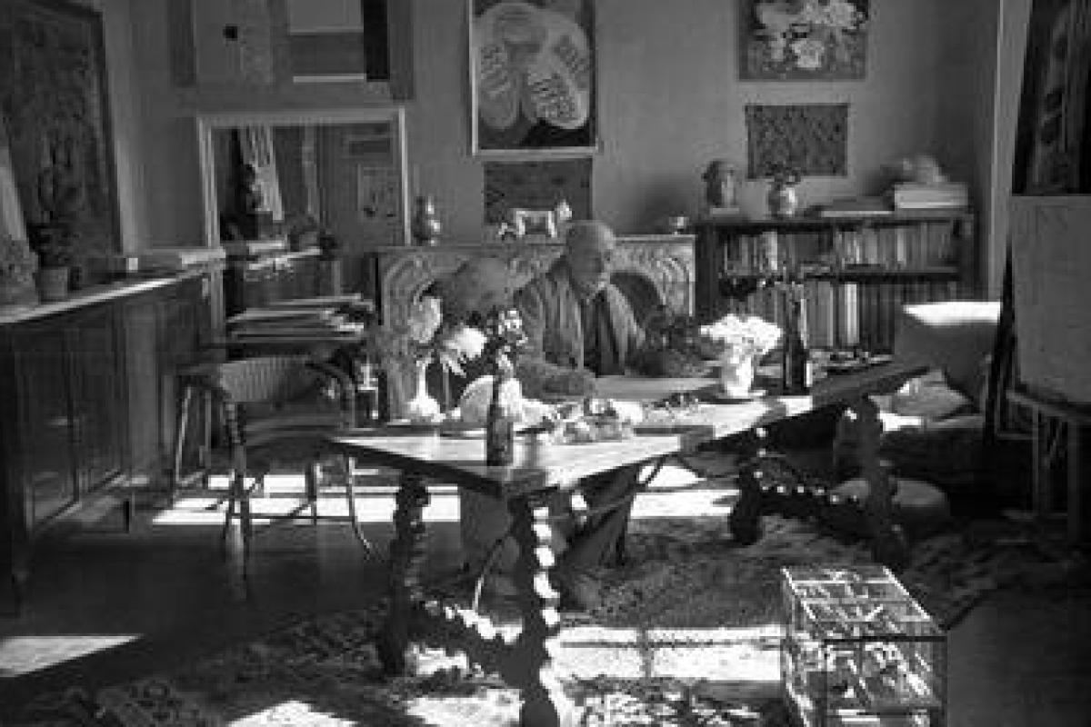
Photos of Matisse in his studio revealed a man surrounded by carvings, bottles and textiles, porcelain bowls and pewter jugs.
There were Arabic screens and African figurines.
There was a Cambodian statue, Kuba embroidery and a Spanish vase.
These artefacts were not particularly valuable, but they were more than just decorative.
Clearly Matisse found them meaningful, provocative, suggestive.
And they were very much present in his art.

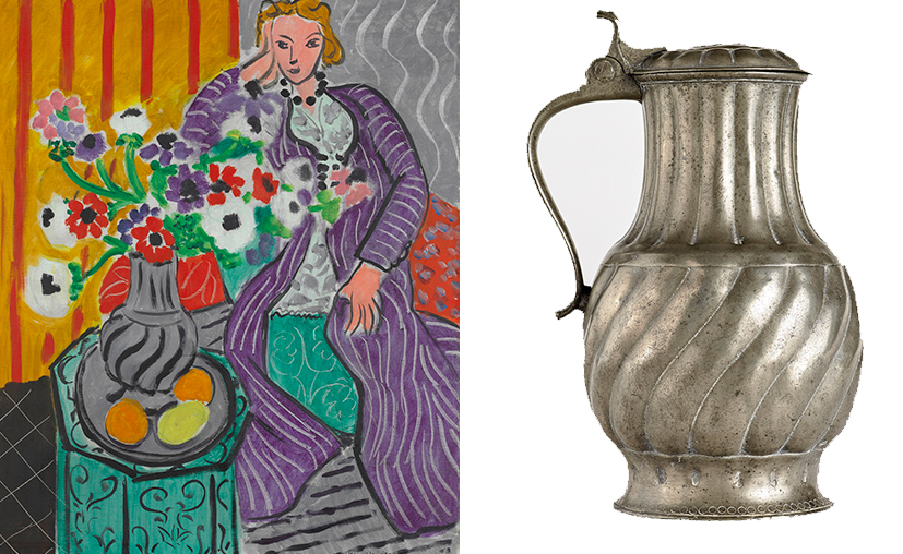
Matisse, 'Purple Robe and Anemones’ and the C18 pewter jug that inspired it.
A silver chocolate pot Matisse received on his wedding day was depicted repeatedly, with differing degrees of abstraction; African masks prompted a serene style of portraiture; a Venetian rococo chair with a curious seashell design was interpreted from various perspectives; a marble Roman torso and a Chinese calligraphic panel induced vivacious colourful cut-outs.
‘The object is an actor. A good actor can have a part in ten different plays; an object can play a role in ten different pictures.’
Henri Matisse
Clearly context inspired the content of Matisse’s art. And he was not just representing these objects. They were catalysts, starting points, springboards for other thoughts and ideas.
‘For me the subject of a picture and its background have the same value…There is no principal feature, only the pattern is important.’
Henri Matisse
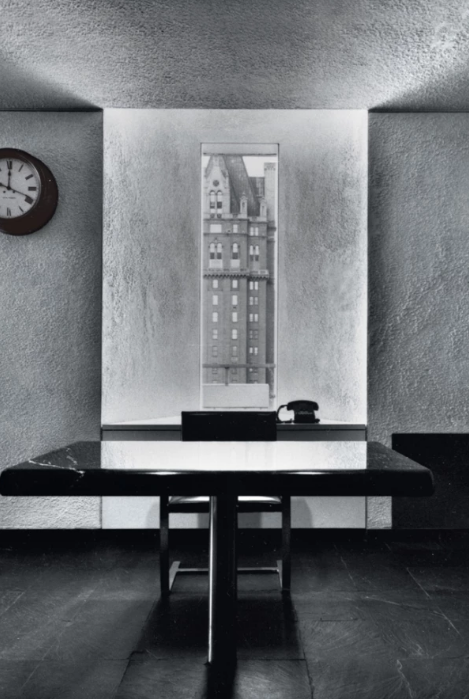
Legendary New York art director and designer George Lois took a different view of the work environment. For him decorative objects, furniture and pictures entailed distraction rather than inspiration. His office resembled a monastic cell - albeit a rather spacious and lofty one.
‘The only thing I ever permit on my desk is the job I’m working on. And, in my work place, there is nothing on the walls (except my nineteenth century Seth Thomas clock) to distract me from what I’m supposed to be thinking about on my desk.’
George Lois

George Lois’ office at Lois Holland Callaway, 1969
Matisse and Lois had decidedly different perspectives, but they shared an understanding that their working context contributed to their creative content.
I’m sure every one of us can recall distinctive work environments that we’ve come across over the course of our careers.
When I joined BBH in the early ‘90s, its Great Pulteney Street offices boasted an austere industrial aesthetic. It was all black, steel, chrome and glass; racked televisions, exposed pipes and rubberised flooring. This look was completely consistent with the Agency’s positioning at the time as an ‘ideas factory.’ It had an attractive tone of confidence and professionalism.
In John Hegarty’s office at BBH you found a painting of an empty box, a large Q & A design and a stuffed black sheep - constant reflections on the power of ideas and the imperative of difference. Next door you could see Nick Gill’s wall of punk singles, which called to mind his personal passion and independent spirit. Nigel Bogle’s space was closer to the Lois model: simply furnished with a few framed award-winning ads, just to ensure we all knew the standard we were aiming at.
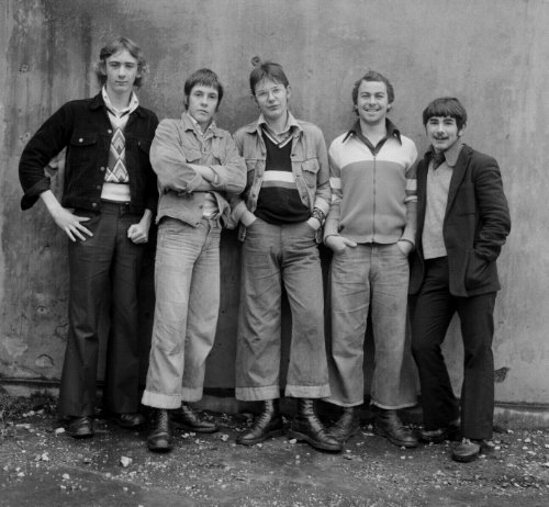
I’m afraid my own work environment was often overrun with piles of paper. I could trace files and documents chronologically by their distance from the top (like the layers in the archaeological site at Troy). Nigel rather generously once suggested ‘untidy desk, tidy mind’, but I fear the towers of A4 just betrayed my paranoia about lost knowledge. I changed office many times over the years. And wherever I laid my hat, I hung twelve photos by Daniel Meadows. In the rarefied world of Soho advertising, I found these ‘70s images of ordinary British folk gently nostalgic and reassuring – a land that time forgot.
Clearly an office speaks – about each of us as individuals, and all of us as a company. So we should give proper thought to what we’re saying.
‘Your working surroundings should not be a presentation to your Clients…And your home should not be a presentation to your friends. Surroundings should relate to who you are, what you love and to what you deem important in life.’
George Lois
I confess I’m no fan of the current conventions in creative office design - conventions now shared, with bigger budgets, by our Clients: the reclaimed wooden tables, the high chairs and industrial lighting; the brightly coloured walls and quirky shaped sofas; the suggestive neon words and slogans; the themed breakout areas and table football; the juice bar, coffee station and artisanal cookies; the beach-hut workstations, the meeting rooms named after Bowie songs; the climbing walls, playground slides and bouncy castles…
Sometimes we equate juvenility with creativity. Sometimes our work environments encourage recreation rather than inspiration, conformity rather than diversity. Sometimes they seem designed for longevity of attendance, not quality of output.
Of course, nowadays few of us are fortunate to have our own personal offices. Whilst we can create context on our desks and screens - and we can create seclusion through our headphones - for the most part our employers control our environments.
Nonetheless, we should still ask ourselves how we’re using the space that surrounds us. Where do we stand on the spectrum from Matisse’s gallery of mementoes, to Lois’ self-conscious minimalism? Does our office environment encourage inspiration or concentration? Does it provide stimulus or distraction?
Environmental design is strategically critical to the culture that a modern business is trying to encourage, and the sense of self it’s seeking to convey. Shouldn’t a creative business curate space, stimulate ideas, spark the imagination? Shouldn’t we be developing diverse, productive studio environments, not happily homogeneous corporate habitats? Shouldn’t our context inspire our content?

Daniel Meadows' 'National portrait' 1974
This article originally appeared on www.jimcarrollsblog.com


