Neil Walker, Creative Director at Dentsu Creative shares how they helped Valspar share their new, innovative approach to paint mixing and home decorating.
It’s rare that a client comes along, gives you a great brief and tells you to be brave. It’s even rarer still that they mean it.
Valspar isn’t just a paint. Choose practically any colour the eye can see and have it mixed on the spot, in-store exclusively at B&Q. Whether that’s from the 2000 paint chips, or (incredibly) bring an object in a colour you adore, they’ll scan it, match the colour exactly then mix it for you to take home.
For the last ten years, paint mixing has steady grown. But there are challenges. Standard, pre-mixed paint is simple. Choose paint, take paint, buy paint. The process of mixing can seem complicated to some. It can seem overwhelming.
The client’s challenge to us at Dentsu Creative, was to make Valspar, and in particular paint mixing, more meaningful - but in a provocative way. To be brave and make people sit up and take notice. That’s kind of the dream brief right?
This had to go beyond just a TV spot. We needed a new platform that would reposition the brand and somehow make sense of the mixing process to the unimitated. Through research the strategy team gathered clearer insights into the customer barriers and misconceptions regrading Valspar and paint mixing. These would be used throughout the entire creative process. Constantly being refereed back to and influencing decisions. It’s worth mentioning here that research also highlighted that those that were already mixing converts, were deeply passionate advocates. The product is genuinely a no-brainier – once you get your head around it.
When it comes to advertising paint, it’s easy to default to just celebrating colour. Which quickly drags you into a wind tunnel of category generic routes that more traditional brands often end up in.
We needed something more ownable. And we wanted to inform and even inspire at the very start of the buying funnel. So, we looked at the mixing process itself. That, after all was the one thing that sets Valspar apart from the brands that sat, ready mixed and waiting on the shelves.
With Valspar, once you’ve chosen your perfect colour, to a tin of blank base paint is then entered into a machine which injects precise quantities of pigment to create that exact colour. That’s then put in what we lovingly referred to as the ‘shakey machine’. And this is the bit people always enjoy watching. The tin is vigorously shaken to mix the contents. Once done, the lid is popped and ta-dah, colour resplendent in born!
Now, in everyday terms, to give something a shake is to wake it up, give it some life, or do things differently. Boom! A flash of inspiration and a three-word idea sits scribbled in a notebook. Shake it up.
A simple line, but one with the energy and power to do a lot of heavy lifting in many different ways…
Firstly, it’s a product truth, inherent in the purchase experience of paint mixing, every tin of paint is shaken to life.
But it also applied to the way Valspar was challenging the paint sector by offering almost infinite choice the nation. Why should the country settle for a finite amount of pre-mixed colours options? By doing things differently, Valspar offers you so much more. 2.2 million more options actually.
And ultimately, it’s a rally call to action, a challenge to shake up you’re your home. Whatever style you’re into whether it’s vivacious vibrants, pale pastels, sumptuous rich tones, calming neutrals or modernist minimalist, Valspar has them all and more in a whole range of finishes. The wall’s your oyster.
You know when you’re sitting on a big idea when the ideas become a steady stream and literally write themselves. Endless ideas. All great. All exciting. All laddering back to the mothership idea of shake things up.
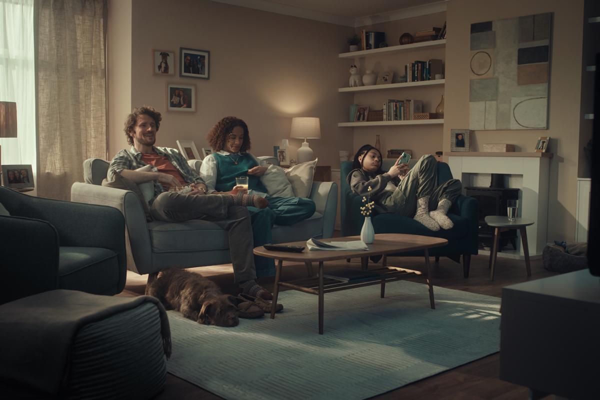
The concept for the film was no different. We knew we wanted to shake a room to reenergise it with colour. It was just deciding what room and whose room. In the end it made sense it would be somewhere in the middle ground. It was decided early on though that we didn’t want to be invited into someone’s home who is ready to decorate. It needed to feel more assertive and confident. Less, “excuse me, would you mind if we brightened up your home?”. More, barging in with a playful attitude that entertaining the viewer with a bit of calamity and chaos. Naturally, the teenager doesn’t as much blink as she scrolls through her socials. A truly typical, modern family.
And, always mindful of the research at the beginning of the process, we agreed with strategy that we need to resolve the spot with a really succinct process sequence, to not only act as a key to explain the root of the shake that that unexpectedly causes the chaos throughout the ad, but to teach people in a few seconds how mixing worked.
Then it was a case of getting the right director on board, Sye (Allen) was given the task of making pandemonium without panic, and ultimately resolving a rather average home into something rather lush.
We’re really pleased with the result. However, I think the thing we’re most proud of is the concept itself. Shake It Up really allows the brand to sell its virtues as a product and a service in ways that feel distinct and ownable – but all rooted in a truth. When you own something as energetic as a shake, you can create truly dynamic – through-the-line communications with a tight golden thread of continuity. And ultimately, when you have a call to action as a brand line, it makes advertising much more to the point.
Watch this space for more exciting elements of the campaign. But till then, if you have a room or a space that could do with a refresh, what are you waiting for? Shake it up.


