Someone shared a tweet the other day that caught my eye – a gallows humour reaction of Beyond.Life’s extensive London Underground campaign proclaiming how their service could help make the end of life easier:
Quite apart from the sad truth the tweet was telling, the thing that struck me most was the revolutionary design of the campaign.
Beyond.Life uses bright sunny yellow – the colour of summer, optimism, sunshine – and clear pricing, highly unusual for a sector typically shrouded in mystery and full of ornate design, antiquated logos, and modest black or grey.
Beyond.life
Rebranding death
Beyond.Life’s campaign is part of a slow, but noticeable shift of the branding of death in the modern world. It takes the clear, no nonsense, optimistic design language of apps and the internet and applies it to the inevitable practicalities that come with the dead and dying. It uses this language to make funereal affairs decipherable, understandable and less scary - adopting a fresh, youthful, open and honest look and feel.
Just like Beyond.Life, Farewill’s online will writing service adopts a sparse, clean, minimal design, using block sans serif typography and splashes of yellow and pink to convey simplicity, ease and optimism:

Farewill
Optimistic colours are not unusual in modern life insurance branding – see Aviva (yellow) and Vitality (pink), but what’s interesting here is the adoption of these cues, meant to celebrate the concept of ‘life’, and applying them to death - changing our perception of end of life systems as something not to be feared, but to be explored, played with, sorted as easily as something like app-based banking.
Even Co-op funeral care’s latest TV campaign used web slapstick and physical comedy to inject optimism and modernity into a typically-sombre sector.
Beyond.Life, Farewill and Co-op stand as great case studies for how a simple change of colour, imagery or simplification of language can transform a category and create instant appeal and interest – making something difficult, easy, something uncomfortable, simple.
Digital afterlives
The sector is not just being rebranded, but also expanded, as new technologies and systems are developed to help people organise and gain some autonomy over their end of life. New services address the uncomfortable grey area that has sprung up in the age of social media – giving people a chance to decide and curate how they’ll live on digitally. For example, Afternote is an online platform that helps you create a ‘digital legacy’ - a place to record your wishes for your funeral, messages for your loved ones, and curate your own picture/video online timeline for people to access when you’re gone.
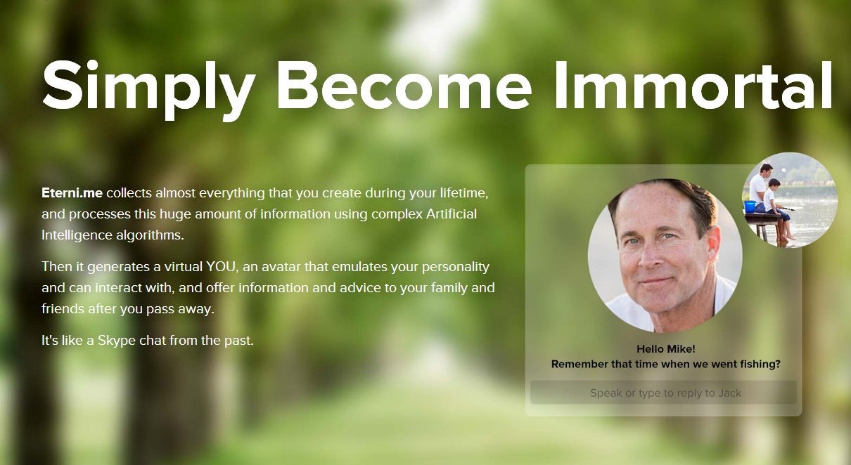
Services like this are helping us to accept a real modern truth – that our data and online presence doesn’t disappear when we die. Our ‘afterlife’ is changing, and will continue to do so in the future. Some companies could be taking this idea too far, however; Eterni.me’s controversial replicant avatar learns how to speak like you so it can exist online once you pass on. This idea may be comforting to some, but others are not gladdened by the thought (feeling uncomfortably close to some of the technologies hypothesised in Black Mirror).

Eterni.Me
Death, just another part of life
Regardless of how one feels about these ‘afterlife’ programmes, or about how funeral care has been rebranded, what these services have in common is that they talk about death directly and unashamedly. Through design choices and branding, death is being reframed as a part of life that one can, to some extent, have control over.
This piece was by cultural expert and semiotician Becks Collins. Follow her @semioticlondon


