Every now and then, the esoteric world of graphic design comes crashing into everyday real life, and typography nerds go head to head with… well, normal people who don’t really care.
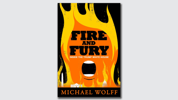
Last week the collision involved the book cover design for Michael Wolff’s sensational White House exposé Fire and Fury and a panel of army jurors with something to say about its aesthetic.
‘Ugly’, ‘horrible’, ‘what a waste’, ‘hilariously bad’, are some of the politest things said about the design of the year’s biggest publishing story.
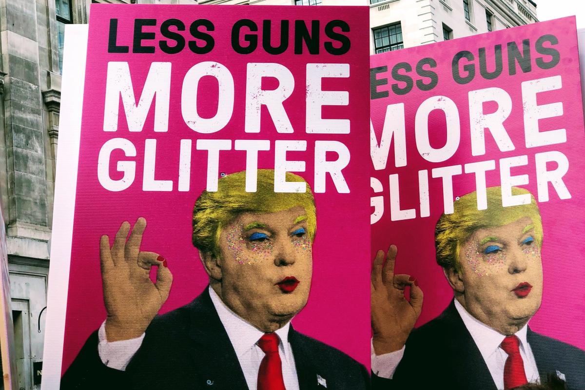
Edel Rodriguez, whose cover designs for Der Spiegel, Time and New Statesman have given us some of the most iconic imagery of the Trump administration to date, even offered an alternative design for the cover.
It’s good, isn’t it?
More intelligent, more impactful, and more distinctive. So why do educated, clever people keep using bad design for important stuff?
It’s a question asked by Ryan Gosling in this brilliant sketch for Saturday Night Live, in the haunting tale of one man’s torturous relationship with a shitty typeface called Papyrus (The font used by James Cameron for blockbuster film Avatar).
I have no idea why James Cameron used that font, and it offends me as much as the next person.
![]()
But I’m not sure that thoughtful, clever and crafted design is necessarily ‘good’ design. Isn’t the only good design the kind of design that does the job it needs to?
When scientists announced the discovery of the Higgs Boson particle in 2012 it was the most significant milestone in physics for decades. But the moment was overshadowed by the reaction to the mode of its delivery to the world: in a PowerPoint presentation set in comic sans. Designers were in uproar. How could such a crucial discovery be treated with such nonchalance, such disrespect for design, such inappropriate friendliness?
Perhaps, however, comic sans was absolutely the right choice for those scientists. Nothing says ‘I really have bigger things to worry about than a font’, than comic sans. Indeed, we should all be grateful that Fabiola Gianotti didn’t give a fuck.
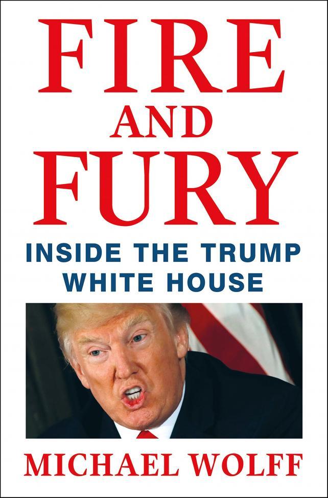
So what about that book design?
Fire and Fury adopts the established vernacular of the American political books, and in so doing it borrows immediate context and understanding. The book didn’t need to look different to get noticed and chosen – the lunatic on the front cover did that job already. Some experts believe that if Fire and Fury had been given a better design, it simply wouldn’t have sold as well.
And last time I checked, that’s the point of a book cover.
So perhaps there’s no such thing as ‘good design’. There’s only ‘appropriate design’. And anything else is just an opinion.
Sad!
By Katie Ewer. Follow her @katiewer