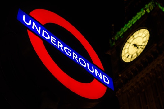
“The logo is an identifier but it’s also something that stands-in for who you are.” — Steven Heller
In July 2016 it was announced that The London Underground logo is to be celebrated with a permanent exhibition in the Design Museum. Mayor Sadiq Khan nominated the “bold, simple and colourful” design to feature on the Crowdsourced Wall, alongside 300 other objects nominated by the public.
The Design Museum is set to relocate to the former Commonwealth Institute in Kensington on November 24th this year and we are looking forward to seeing some of the UK’s most iconic works of design.
In the past logo design has been seen as a marketing tool, however, technology has changed the way we perceive logo design and has given society their say on why logo design is important to them.
Let’s have a look back on the history of The London Underground roundel and why it should be classed as a modern day piece of art work
100 YEARS OF THE LONDON UNDERGROUND LOGO

Author of “Deconstructing Design And The Power Of Logos”, Steven Heller believes that we are living in a time where branding is an art form, which is why the Design Museum’s reopening in December is so important.
The London Underground logo is one of the UK’s most recognisable symbols. The bar-and-circle design, also known as the London roundel, was born in 1908 and still has kept its from as a commercial transport logo as well as a national icon. But what makes a logo memorable? Professional Logo Designer, Repeat Logo, think that “Having the appropriate logo will help your business to make the best first impression to your customers and to communicate clearly the purpose of your brand.”
With the roundel in mind, it represents nothing in particular but it was designed to for the purpose of being memorable and easy-to-read. The function of this logo was to be a clear indicator that there was an underground station nearby.
The main purpose the London Roundel was to make the service stand out, in the UK’s extremely large and populated city. Over the years the design has been adapted with tweaks to its colour and typography, however, as a symbol, it has stayed strong in London’s forever growing community.
THE IMPORTANCE OF PROFESSIONAL LOGO DESIGN
The bar and circle design is the face of this London institution and is a coherent graphic identity for the Underground. The present red-and-blue colour scheme of the Underground roundel at North Greenwich station is the most authentic version of the design and has been mirrored in pop cultural shorthand by bars, clubs and fashion labels all over the world. There is a lot to learn from a logo design like the London Roundel, for instance, some may say that the incorporation of red is significant as represents the immediacy of the London underground. But as you may know red is a prominent in many logo designs.
Colour connotations in logo design can stand for many things. The Huffington Post claim that red generates excitement around a brand and in fact red colouring has the ability to raise consumers pulse rates when they look at it.
Getting the colour combination just right is vital in the art of logo design. With regards to the London Roundel, a little less is more. It is proof that just two or three colours to a logo can be more eye-catching than a logo that uses a plethora of shades. The UKs most recognisable brands utilise colour well, from Virgin to Marks and Spencer they all increase their brand recognition and visibility by showing loyalty to a specific colour scheme.

ICONIC LOGO DESIGN
Think about all of the logo greats - Coca-Cola has kept it traditional and has toyed with the idea of changing its logo design but has always returned to its well-known form which was developed in 1885. The old saying “if it’s not broke don’t fix it”, comes to mind when discussing popular logo designs. Just look at millennials’ recent reactions to Instagram and Netflix’s rebrands.
Trends come and go, so if you are developing a logo design, keep it original. We are sure to be celebrating the London Roundel for years to come, due to its cultural impact and a stamp on British History. Until the opening of the exhibition in December, you can look a little more closely at the design history of the London’s underground here.
Melissa is a branding specialist and content writer for Repeat Logo and Create an Infographic. She uses her knowledge of logo design to guide businesses to success.
Follow her @Melissalangx
