It takes a brave designer to muck about with anything to do with our national game.
So the recent change to The Premier League identity for the 2016/17 season was bound to be met with dog’s abuse, whether it’s strikingly brilliant or not.
The task is akin to a penalty-taker in a shoot-out. Scoring is expected. And even then, there are widely varying degrees of appreciation.
So, on that wide continuum, does the new identity get neatly tucked in to the corner of the net or has it been blasted - think Waddle, Turin 1990 - over the bar?
Before getting stuck in to the design, there has been one fundamental significant change. The 2016/17 season will not have a sponsor for the first time in its 24 year history, so it’s goodbye to Barclays from the logo.
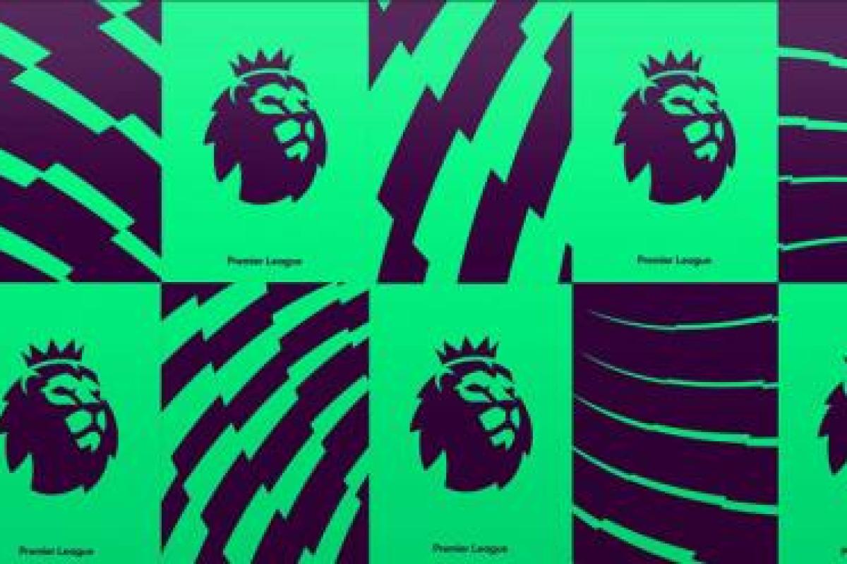
In the new design, the lion has been retained but is now disembodied and the ball, on which one of its paws previously rested, has been booted off, leaving a floating lion’s head wearing a crown. Beside the lion’s head it says ‘Premier League’ in a rounded sans type. The accompanying colour palette of red, sky blue, green and yellow is apparently not attributable to any particular team. Thereby not upsetting or delighting anyone from Anfield to White Hart Lane nor causing conflict between N5 and SW6 or any further enmity between the blues and the reds of the North West. Oh and it’s been designed with digital-first in mind.
![]()
So, sat in the stands, as a neutral observer, removing any allegiances, what do we think?
Here’s some perspective. The Premier League is the most watched football league in the World. It was born from the football league, founded in 1888, the oldest professional league in the world. The UK broadcast rights alone sold for £5.1billion, thereby maybe explaining the lack of a need for sponsorship. It is broadcast in 212 territories, working with 80 different broadcasters. It goes kicking and screaming in to 650 million homes and the TV audience is 4.7 billion.
Meaning - as even the slowest centre-half can work out - it’s a huge global brand, one of the most important exports from the UK with many more eyes on it overseas than locally by several long-ball clearances.
Why is it so popular? It’s fast, fierce and in your face. It’s unpredictable. It’s tribal. It’s full of deeply ingrained rivalry with loyal and diverse fans. It appeals to Eton boys, Moss-side lads and Geordie lasses equally. It’s authentic. It’s mad, bad and beautiful. You can’t take your eyes of it. It’s primal scream. It’s as English as warm beer but has a cast of the best in the global game. And, for sheer unadulterated entertainment, it’s easily the most competitive league in Europe.
So how come this new identity doesn’t carry that energy, authority and hairs-on-the-back-of-your-neck excitement?
Compare it to one the great Sports League identities, the NBA logo, featuring a silhouette of All-Star Jerry West, designed in 1969 and as fresh today as it was then.
![]()
The NBA logo does four things that the Premier League logo should do but doesn’t do and indeed four things that are necessary for any great Sports identity.
- Own the sport. The new Premier League logo could be for almost anything. What bit of it says football? The NBA logo captures basketball with all its grace and energy.
- Origin really matters. 4.7billion people watch the English Premier League because it’s English. What’s English about this logo? The NBA logo is brilliantly American.
- Official with style. The new Premier League logo lacks authority. Sometimes it’s okay to bestow some grandeur. The NBA logo looks like it has had the last word in any conversation to do with basketball.
- Obscurification never wins. But simplicity does. This is an international symbol and needs to communicate at speed to billions of people. Show the new Premier League logo to anyone anywhere in the world and ask what it is for. Do the same with the NBA logo and see what happens.
Basically, if the NBA logo and the Premier League were to have a shoot out, there’d only be one winner and it ain’t got paws. The new Premier League logo is neat and clean and tidy and I’m sure works well digitally. It’s corporate, cryptic, contrived and uncool. It relies on the fact that because we remember what the previous Premier League logo looked like we understand this one. And the acid test, will anyone want to wear it for its sake alone, as they do with NBA logo, unlikely.
On the penalty continuum, it dribbles in to the net. It’s not a mess, but it’s definitely not Messi.
This blog was written by Philip Davies, EMEA President, Siegel+Gale.