It’s not easy selling news these days: it’s hardly a front page story that newspaper sales have been slowly heading south for some time, prompting the need for their owners to look for alternative, more sustainable commercial models. So after the launch of The Guardian’s new tabloid-format paper this week, it won’t be surprising if headlines about it focus on survival as the driver of change. After all, Guardian Media Group have been open about the move being part of their ‘transformation plan’ to save millions for the business.
The brand-wide re-design that accompanied the switch feels less expected. Its arrival was heralded with a 30-second online clip, during which a blank white box obscures a series of news-flavoured clips (a little reminiscent of Bowie’s ‘The Next Day’ artwork). We’re told that this space represents The Guardian as ‘a space for big ideas’.
Few re-brands are met with immediate applause, it has to be said, and for a news brand you can come to know intimately through daily use, it’s always going to take a bit of getting used to. But initial responses can be quite telling, and what first stands out is how safe it feels: a little at odds with a champion of independent news journalism.
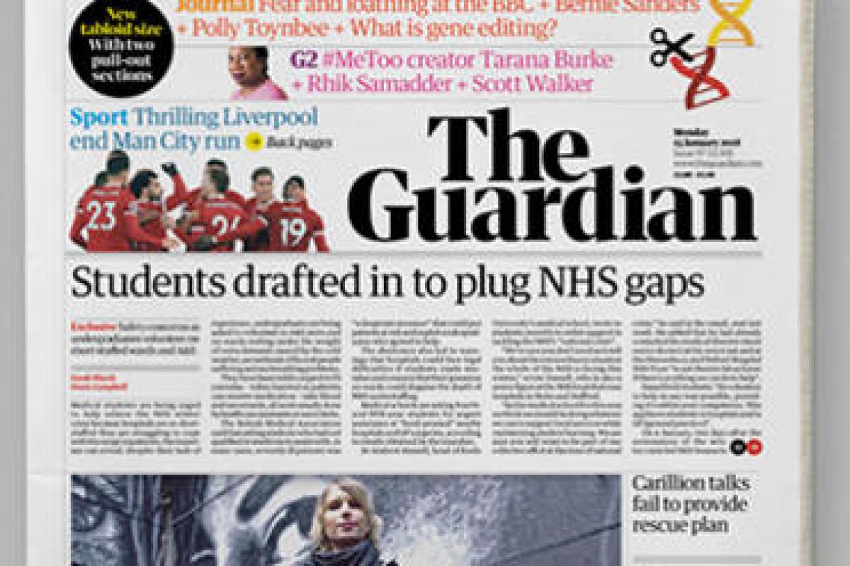
Gone is the instantly recognisable dark blue belt with lower case logo, replaced with a new monochromatic masthead in title caps. It’s certainly confident but feels somewhat traditional, with its two-tiered shape just adding that little contemporary touch. The new ‘G’ icon used for the app looks a little cooler, but feels a little out of keeping with the rest of the design.
Sadly, it just doesn’t stand out on the newsstand anymore: from what felt like a beacon of difference to another tabloid lost among the noise of black and white. But The Guardian has never been about black and white: it’s a brand that acts as a space for ‘new voices…the unheard…whistleblowers…for hope’, as the aforementioned trail clip claims. It feels like something of that attitude has been lost.
Maybe it’s a response to the times (rather than The Times), but it also feels a tad solemn as a front page and particularly within the mobile app landing page, where the black, white and red scream ’serious stuff!’ as if the news wasn’t all a bit shitty already.

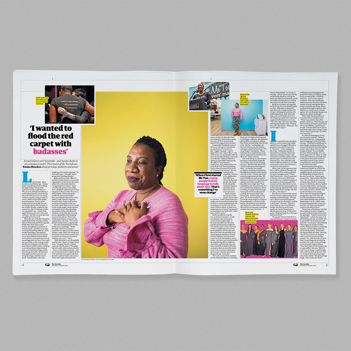
Where the re-design starts to show more value is in its addition of brighter, vibrant colours into the palette. In print, it lifts the G2 section to something more magazine-y and the new Journal supplement is given a background of subdued salmon (I’ll never make a career out of naming paints at this rate), which feels fresh and allows brighter, poppier colours to pull out key points and create eye-catching infographics. From the desktop homepage, however, headline colours are used as navigation through news, opinion, sports, lifestyle and culture, but in practice, scrolling down the page, it makes for a bit of a colour riot and ceases to be helpful.
It’s not entirely clear what this re-design is trying to fix. At its best it can help give some space and energy to some of The Guardian’s great content (except, ironically the news-ier parts of it), but it lacks that immediate difference and impact. It’s still early days, of course, and we’ll soon see how this new look explodes out to weekend magazines, and The Observer. For now, it needs some bedding in and some good time to see if it can help protect the brand and all it stands for into the future. I hope it can.
This piece was by Anthony Cox, Associate Director, Head of Strategy at Dragon Rouge London. Follow them @dragonrougeuk


