Apple has just released a series of long copy ads with the help of advertising agency TBWAMedia Arts Lab, USA. Does this mark a return to the heyday of long copy advertising? Sadly, but definitely, not...
When I heard about Apple's new long-copy campaign on Twitter, I admit to feeling a tingle of anticipation. Something told me this was going to be great.
For one thing, long copy is due a proper return. It has occasionally reared its head over the years, but it always felt like it would take a major brand like Apple to do something on a par with the greats of the past. Not just a retro imitation, but a proper reinvention that works on its own terms.
And there's something especially intriguing about Apple doing it. They're such a minimal brand – all white space and understated cool. What a change in direction it would be to see lots of words coming from them. Especially when they've got so much to say.
The timing is also interesting. Right now, it feels like more and more people are questioning Apple's claim to superiority. Maybe this was Apple about to come out and tell a few home truths. Remind us exactly how great their products are and why. Make us fall in love with them again. I had all this in mind when I went to look at the ads.
Here's the copy in full:
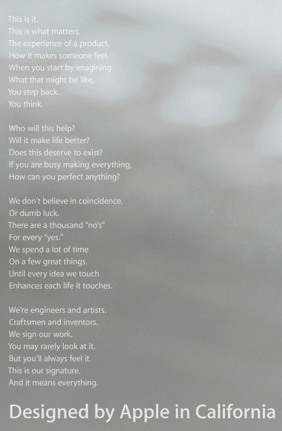
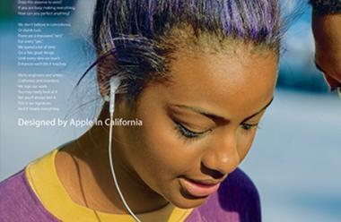
There are four executions in the campaign, each featuring a different image, but the same copy. There's also a film version, with an edited version of the same copy.
So is this a return to the heyday of long copy? The rediscovery of a lost craft in the service of one of the great brands of our times?
Sadly, but definitely, not. The copy is dire. Vacuous, boring, self-regarding and counter-productive. It starts with a glimmer of promise – the point about designing things with the user in mind – but then goes precisely nowhere with it.
Arguably the worst thing is that it's entirely free of information. The point is too obvious to need labouring, but look briefly at one of the old classics:

Put aside the clever headline, sharp tone and expertly crafted momentum that carries you to the end – and look at the actual information being conveyed. 32 miles to the gallon. Five pints of oil. No need for anti-freeze. 40,000 miles per set of tyres. Smaller parking spots. Lower insurance. Cheaper repairs.
The same goes for this Timberland long-copy classic:
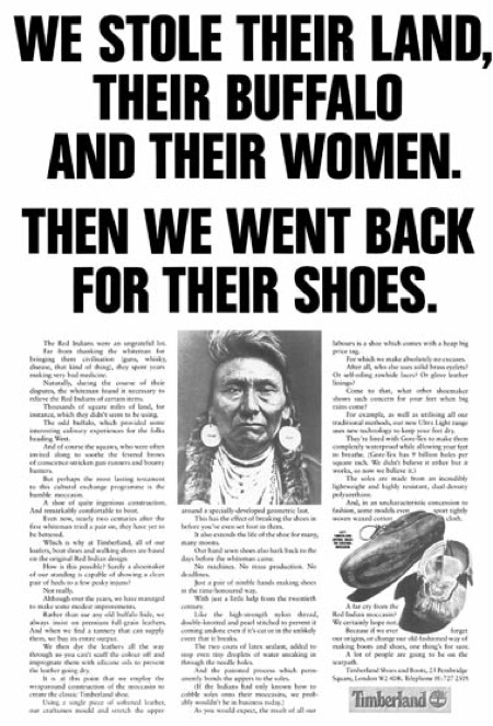
It may have dated in terms of social attitudes, but look it up, read it from start to finish and see how hard the copy is working.
You learn all about the details of how the shoes are made. Not just the inspiration for the design and the philosophy behind it, but the nerdy details of how the design has been subtly improved over the years. And the details are interesting. Strip away the jokes and the rhetorical tricks and the tone of voice and you're left with a pile of solid, irreducible facts.
With the Apple ad, you get nothing. You search in vain for a single detail or piece of evidence. Something that demonstrates how they design from the point of view of the user. Any small detail that signals artistry, craft and invention without simply proclaiming it.
Of course, there's one difference that Apple could use to defend itself. Unlike Think Small or Timberland, this isn't a product ad. It's a brand ad. It's not about explaining the details of a particular product to you, but giving a more general sense of Apple and its values and philosophy. We're not in the era of hard sell any more; it's more sophisticated these days.
It's at this point I begin to lose the power of rational argument and feel like throwing things at hard surfaces.
First of all, I can't think of a better ‘brand ad' for VW or Timberland than the ones above. Each of them leaves me with a pretty good impression of the brand, its philosophy and its values.
Secondly, I can't think of a worse brand ad for Apple than this one. Has no one ever told them that you don't convince people you're cool by going on about how cool you are? They start the ad by saying they think about everything from the user's point of view, then spend the rest talking relentlessly about themselves.
The final lines are a veritable orgasm of self-regard. You put your logo on your product? That is a massively uninteresting thing to tell people. It might conceivably be interesting if Apple didn't put their logo on their products, but relied on people working it out for themselves because they're so brilliantly designed – that would be a story to tell.
Equally, it might be intriguing if Apple resurrected the – genuine – story of how they used to etch the names of their team members onto their circuit boards as a hidden mark of personal ownership and pride. That's a good story. The copy looks like it might be heading in that direction, but then veers back into generalisations at the last minute.
Life's too short to analyse all the other vacuities and non-sequiturs, but it gets particularly bad in the second-to-third ‘stanzas':
If you are busy making everything,
How can you perfect anything?
We don't believe in coincidence.
Or dumb luck.
There are a thousand "no's"
For every "yes."
What's actually being said here? Which company out there claims to make everything? Do you really mean ‘perfection' when your products by their nature go through constant iterations and improvements?
And why the sudden jump from perfecting things to coincidences? What's dumb about luck? Don't luck and serendipity play a part in the design process? Why are you talking in riddles? Tell us what you mean. Give an example. This reads like a succession of those vaguely New Age quotes that people stick on Facebook with a picture of a sunset.
Possibly the most excruciating thing about the advert is that it contains its own damning critique, right here:
Who will this help?
Will it make life better?
Does this deserve to exist?
Did anyone ask the same questions about this copy or this campaign?
And there's one last issue – those line breaks. It's become a disturbing trend in long copy ads to lay them out like poetry. Tesco did the same thing with its recent (pre-George Osborne) apology ad:

It's tangentially interesting that both Tesco and Apple make use of the phrase ‘This is it' in their copy. The similarity is telling –it's one of those emphatic phrases that is pure tone and no meaning. The kind of thing you say to convince yourself something is happening when it isn't. If you find yourself including it in a piece of copy, you know something has gone wrong.
The line break trend is annoying to anyone who likes poetry, where line breaks are intrinsic to the meaning and not just a decorative feature (at least in any half-decent poetry). But there's something particularly annoying about it in the context of these brand ads.
It's being done for a reason – to elevate the tone and lend an air of preciousness and high-brow appeal. If it looks clean and vaguely classy, maybe it will give the copy an aura of intelligence it otherwise lacks. Maybe you won't notice it's saying nothing if you're too busy admiring how it looks.
So what's the positive alternative I'm advocating? Well, it could be one of two things. You could try a faithful return to the traditional long-copy ad – why not? If Timberland can talk at length about what makes its latest shoe so great, surely Apple has plenty to say about its latest product? I'm sure there's mileage in writing a brilliant ad packed full of product details that demonstrate Apple's philosophy and ‘values'.
But equally, I don't think you have to return slavishly to the old USP-driven model. You could write a more high-level brand ad, but one that says something. Being a brand ad doesn't let you off the hook. You still need a message. Every word has to earn its place.
And it's not like there's nothing to say. You're talking about one of the most interesting and impressive companies in the world. Whatever angle you choose to take, you should have trouble fitting it into a full-page ad. This one is padding from the first line.
I was hoping to welcome the return of long copy on seeing this new campaign, but it turns out to be a hollow and lifeless return. Like watching a hologram of David Ogilvy. This is long copy drained of all the things that make long copy worth doing. Static and soulless and empty. The written equivalent of a mood board.
One last footnote: I strongly suspect the motivation for this campaign came internally – it doesn't feel like the work of the same agency that produced 1984. Tellingly, the script is based on a new mission statement that Apple launched earlier this year, apparently to reassure the world that the company hasn't lost its way since the passing of Steve Jobs.
For me, the fact they're spending their time producing mission statements, brand films and copy like this is a sure sign that they have.
This article originally appeared on the Asbury & Asbury and Creative Review blogs and is reproduced with permission.
[Related Articles] Creativity starts with a boom - inside track on the Real Mad Men
Newsletter
Enjoy this? Get more.
Our monthly newsletter, The Edit, curates the very best of our latest content including articles, podcasts, video.
Become a member
Not a member yet?
Now it's time for you and your team to get involved. Get access to world-class events, exclusive publications, professional development, partner discounts and the chance to grow your network.